
Wednesday, March 31, 2010
Gold Outperforming Euro - Positive Divergence for Gold
Gold breakouts are usually preceded by periods of relative strength vs the the Euro - just like now. Notice how there currently is a positive divergence. Relative to the $USD, Gold is performing much better than the Euro.


Monday, March 29, 2010


Bullish GLD:UDN Renko Charts

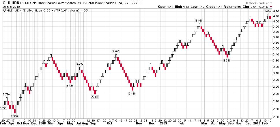

- Long term weekly Renko chart still in uptrend
- Short term daily Renko chart made a new high and is currently back testing the breakout
- Intraday Renko chart is looking bullish
Saturday, March 27, 2010
Philosophy of Technical Analysis
As you have probably have noticed by now, I primarily use technical analysis as my market analysis methodology. I believe technical analysis is superior to fundamental analysis because "fundamentally" it's all about supply and demand. What better way to understand the supply and demand than studying price and volume action using charts. The major flaw with fundamental analysis is that information is with held from the public until it's too late. Only after the insiders and big money has acted upon the information is it then released to the public. How many times have you asked yourself, why is the stock market going down when the "fundamentals" are good (based on the news) or vice versa. That's why I say ignore the news because it is simply distracting and misleading. You can tell if the stock market is bearish or bullish simply by looking at a chart. Have you ever heard this one before : "the stock market leads the economy" or "the stock market is a leading indicator of the economy". For example, why is the stock market going up when the news says the fundamentals for the economy are poor? Who cares why. The bottom line is the bottom line. I recommend everyone read the following book by John Murphy: Technical Analysis of the Financial Markets: A Comprehensive Guide to Trading Methods and Applications (New York Institute of Finance)
Here's some key take aways from Chapter 1, titled "Philosophy of Technical Analysis". Technical analysis is defined as the study of market action, primarily through the use of charts, for the purpose of forecasting price trends. Market action includes price, volume, and open interest.
Technical analysis is built upon the following premises:
- Market action discounts everything
- cornerstone of technical analysis
- anything that can possibly affect the price (fundamentals, politics, psychology, etc) is actually reflected in the price of that market
- Prices move in trends
- a trend in motion is more likely to continue than to reverse, i.e., a trend in motion will continue in the same direction until it reverses - basic Newton law of motion
- History repeats itself
- patterns have been identified to repeat in charts because they are shaped by human emotions and psychology, which tends not to change
- If the fundamentals are reflected in market price, then the study of those fundamentals becomes unnecessary.
- Technical analysis can be applied to virtually any market and time dimension
- Technical analysis can be used for economic forecasting - stock markets lead the economy
Kitco Gold Index ~= GLD:UDN
I need to give credit where credit is due. The Kitco Gold Index is where I got the idea of factoring out the effect of USD currency fluctuations from the real supply-demand curve. This can easily be done by plotting a ratio of the equity to UDN. In my previous post I showed you the true picture for GLD and GDX. To show you that this methodology is valid, let's compare a chart of the Kitco Gold Index to my chart:

For a more direct comparison, I'll first show a daily line chart:

However, I prefer to use plot 3 EMA's to smooth out the "noise":

It's not an exact match to the Kitco Gold Index because I am using slightly different data. I am using data that is available to the "common" man - simple ETF's which won't mirror the underlying instrument exactly. However, as you can see, the GLD:UDN chart is pretty close to the Kitco Gold Index.
Friday, March 26, 2010
True Supply Demand Picture for Gold is Very Bullish
My first ever Blog post was titled How to factor out the USD from the "true" picture
Shall we ...

Factor out the $USD, and GLD has clearly broken out. It is merely consolidating after the breakout.

If you factor out the USD for GDX, the Gold miners look even more bullish. What GDX really did was retest the breakout, and it has been confirmed so far.
In summary, GLD and GDX broke out, and they are now back testing. If the back test is good, then here comes the leg up for Gold. Sit back and enjoy the ride. This should be a huge move coming up next.
So Far So Good For Gold
Below is today's update of the 60 minute GLD chart:

GLD filled the gap with a strong move today, and $GOLD finished above $1100 which is very promising. The continuation reverse head and shoulders pattern is looking textbook:

GLD held at support on Wednesday. On Thursday, GLD stabilized with an indecision candle, but was followed up with a long white candlestick. Of course, GLD needs to follow through on this and break through the 110.5. Basically, in order to break out of this pattern and resume the uptrend, GLD needs to break through the neckline. The gold miners are saying they will:

I am using the 3 day EMA to reduce the "noise" and draw a more accurate trend line. This chart is saying that the Gold miners broke through the down trend in early March, and a higher low develops, then this is pointing to more higher highs ...

The Renko chart is also confirming the breakout - the current short term trend is still up. In my next post, we'll take a look at how GLD and GDX are performing relative to $USD.
Thursday, March 25, 2010
TRIX Showing Gold Consolidation is Coming to an End
Another momentum indicator you can use to keep you on the right side of the trade is the TRIX oscillator.
I am using 60 minute intraday data to build TRIX(377,233) and TRIX(233,144). I use those numbers because they are part of the Fibonacci sequence.

Notice how the TRIX(377,233) is starting to flatten out. Keep an eye also on the TRIX(233,144). It looks like it want to kiss it ... which would imply more consolidation, but it looks like we are nearing the end ...
Support Test Coming Up For Gold
In my last post, I identified a continuation reverse head and shoulders pattern, and expected GLD to test support in the 106 area. Well, we are just about there. GLD closed yesterday at 106.30 and had a day low of 106.24. How important is the 106 region? I drew as many trendlines and Fibnocci retracement levels and fan lines as I could going back 18 months:

Let's zoom in ...

Let's zoom in at the last 5 months:


Let's zoom in ...

- GLD did retrace 50% of it's move since last April
Let's zoom in at the last 5 months:

- The higher green line is the 38.2% retracement level for the rise since last April
- The purple trendline is a key support line
- The 2 light blue lines are Fibonacci Fan lines going back to Nov 2008
If GLD does not hold here then the falling channel outlined in red lines will trump the continuation reverse head and shoulders, which would mean a deeper consolidation. Pay attention also to the price by volume bars on the left, as well. Another decision point ...
Tuesday, March 23, 2010
Consolidation Continues for GOLD
Since I don't have access to intraday $GOLD prices, I will be using GLD as the $GOLD proxy:

Looks like another continuation head and shoulders pattern is in process. Let's look at today's action:

On the 15 chart, we can see that GLD filled the gap today, and ran into resistance. GLD needs to clear 108.60, and the next resistance zone is in the 109.5 - 110 range. Take note of the "marker". From experience, I would say do not ignore these.

Looking at the 60 minute chart, we can see a lower high and a lower low. In other words, it looks like a short term down trend has started, and I have drawn a channel. GLD did find support at the 50% retracement level, but I am expecting one more lower low to reach the 61.8% Fibonacci retracement level. Once again look at those beautiful Fibonacci fan lines.
Monday, March 22, 2010
USD Renko Strategy
Let's first look at some UUP candlestick charts:


On the intraday chart, UUP gapped up on the open, but was under pressure all day closing lower. However, it did find support at the previous gap. This could be a possible bull trap. If the uptrend line is broken on the daily chart, the next support level is at 23.28 - at the 38.2% Fibonacci retracement level. The weekly chart also shows that UUP has run into resistance as well. We are at yet another decision point. What side of the trade should you be on? Renko charts can help you with that ..
Short Term - Bullish

Medium Term - Bullish

Long Term - Bearish

The long term dominant trend is still down on the monthly Renko chart. However, the weekly Renko chart shows that the USD is still in a medium term up trend. Wait until the weekly Renko trend reverses before rejoining the USD bear camp. If you plan to short the USD, then use the daily Renko to fine tune your trade.
Sunday, March 21, 2010
How to use Renko Charts
You always want to trade with the major trend - the trend is your friend. Renko charts differ from traditional price charts because they ignore the passage of time and focus on price action and trend. Other types of charts with a similar perspective are Point and Figure, Three Line Break, and Kagi charts.If you want to learn more about these, I recommend the following book: Technical Analysis from A to Z, 2nd Edition
Let's take a look at some $GOLD Renko charts:


Use the weekly chart to filter trades using the daily chart to ensure you are trading with (not against) the longer term trend.
Let's take a look at $XAU and $HUI:


Daily Renke Charts


Now, let's step way back and see the big picture for GOLD using a monthly Renko chart:

The long term trend is still secure. Use the weekly charts to identify the dips and daily charts to time the trade execution.
Saturday, March 20, 2010
Comparing GOLD Consolidation Periods
In Friday's post, "Gold is Holding On", I asked you to compare previous consolidation periods to the current consolidation in GOLD that started in Dec. The key to understanding the future lies in studying the past. In other words, "history repeats itself" which can be seen by identifying chart patterns. Chart patterns are reliable and repeatable because they are the pictures painted by human psychology and emotions.
Let's take a look at the current picture, and then step back in time:
2010

2009

2008

By visually inspecting the charts, I would say the current 2010 period has closer resemblance to 2008 that 2009. Basically, GOLD is currently consolidating after making another all time new high, as it did in 2008. If it wasn't for the stock market crash, GOLD looked like it was on its way to making a another all time new high in 2008. Instead, GOLD was forced to retest it's previous high before resuming it's uptrend. Thus, unless the stock market crashes again, expect GOLD to continue making new highs.
Another stock market crash is inevitable. However, I believe hyper-inflation will precede another stock market crash. The United States (and Europe) pretty much has no choice. The country will be running under a massive deficit for an extended period. The easiest way to "reduce" the debt is through hyper-inflation. Once the debts and deficits are under control, expect the US to take a page out of Paul Volker's playbook. Interest rates will keep increasing until finally we come full circle ... DOW:GOLD ratio back to 0.5 - 1. When that occurs, sell all your GOLD assets and move right back into stocks.
Friday, March 19, 2010
Decision Point for GOLD - Mar 19 Update
Below is the updated chart that I posted last Friday


- Big decline today on high volume
- Fib Fan line support line was penetrated
- Possible head and shoulders pattern forming
- Mar 16 gap was filled
On the intra-day chart, the picture looks short term bearish. However, as can be seen from my previous post, Gold is still holding onto the falling wedge breakout. The jury is still out ...
Gold is Holding On
Strength in the USD continues to put pressure on Gold. Gold was knocked down today but it is not out.

The falling wedge breakout is still holding. The 21 EMA is still above the 55 EMA, but GLD did cross both today on good volume. The good news is that the 89 EMA is still holding and the major up trend is still well in tact. I would also like for you to compare the Jun - Sep period with Dec - present. Tell me what do you see?
Let's add some Fibinacci Fan Lines to the picture:

Note that GLD has only retraced 38.1% and how well the fan lines work. Let's compare GDX:

The Gold miners did better on the way up, but are faring worse on the way down - as usual. Overall, GDX has performed better since Jan 2009:

Thursday, March 18, 2010
Invest in Venezuela Gold via Rusoro Mining
The 3 keys to a successful mining company are : "location, location, location" ...
- political stability
- security
- infrastructure
- transport
- power
- refining
- capital
- personnel
- mineral resources
Venezuela has all of the above except for #1 on the list. Well, "when in Rome" ... I mean, when in Venezuela, do as President Hugo Chavez does. Chavez has given the thumbs up sign to Rusoro Mining, a Russian partner. Here's a couple of key slides from their Nov 2009 corporate presentation:


Subscribe to:
Posts (Atom)


